Top Placed Students
The Top Placed Students section is present on the Home Page of Training and Placement website right after the Student Awards section. This section gives an overview of the top students who got recruited in good companies.
Top Placed Students Component
For this section. we need to create a carousel of slides with information such as student's image, name, company name, and package. For this, we need to create a functional component that will create slides for each student and a carousel with navigational buttons.
Open "TopPlacedStudents.jsx" file.
An array is created where each object represents a slide with student's information with the following properties:
   const slideObj = [
        {
            studentImg: "TopPlacedDummy.jpg",
            studentName: "Jayesh Potlabattini",
            companyName: "Company",
            salary: "20 Lakhs",
        },
        // Other objects representing different students
    ];
- In the next step, we will map through each object within
slideObjarray and create a set of Swiper slides. A<SwiperSlide>component is rendered for each student object. Within<SwiperSlide>component, we are going to see how we displayed student's information:
For student's image:
   <SwiperSlide
    <div className="min-w-full">
        <img
            src={`/TopPlacedStudent/${data.studentImg}`}
            alt={data.studentName}
        />
    </div>
    >
    </SwiperSlide>
Similarly, other information such as studentName, companyName and salary is displayed.
- A
<Swiper>component is created which displays all the mapped slides in a container. It defines the overall behaviour of the carousel and is configured with various props.breakpointsis a prop defined that denotes the change in the number of slides based on the width of the screen.
    <Swiper
        //swiper modules
         breakpoints={{
          420: {
            slidesPerView: 2,
          },
          640: {
            slidesPerView: 3,
            spaceBetween: 30
          },
          768: {
            slidesPerView: 4,
          },
          1024: {
            slidesPerView: 5,
          },
          1280: {
            slidesPerView: 6,
          },
        }}
        //swiper modules
        >
    </Swiper>
navigation prop specifies navigation elements and their associated classes. The elements which are defined with these classes will identify as either previous button or next button.
    <Swiper
        //swiper modules
        navigation={{
          prevEl: ".swiper-prev", //previous button.
          nextEl: ".swiper-next", //next button.
          disabledClass: "swiper-button-disabled",
        }}
        //swiper modules
    >
    </Swiper>
- Two div elements for the previous and next navigation buttons are defined. These elements contain image elements for the navigation buttons which can be seen in TopPlacedStudents.jsx. Also, refer index.astro to see how we displayed the heading of the section.
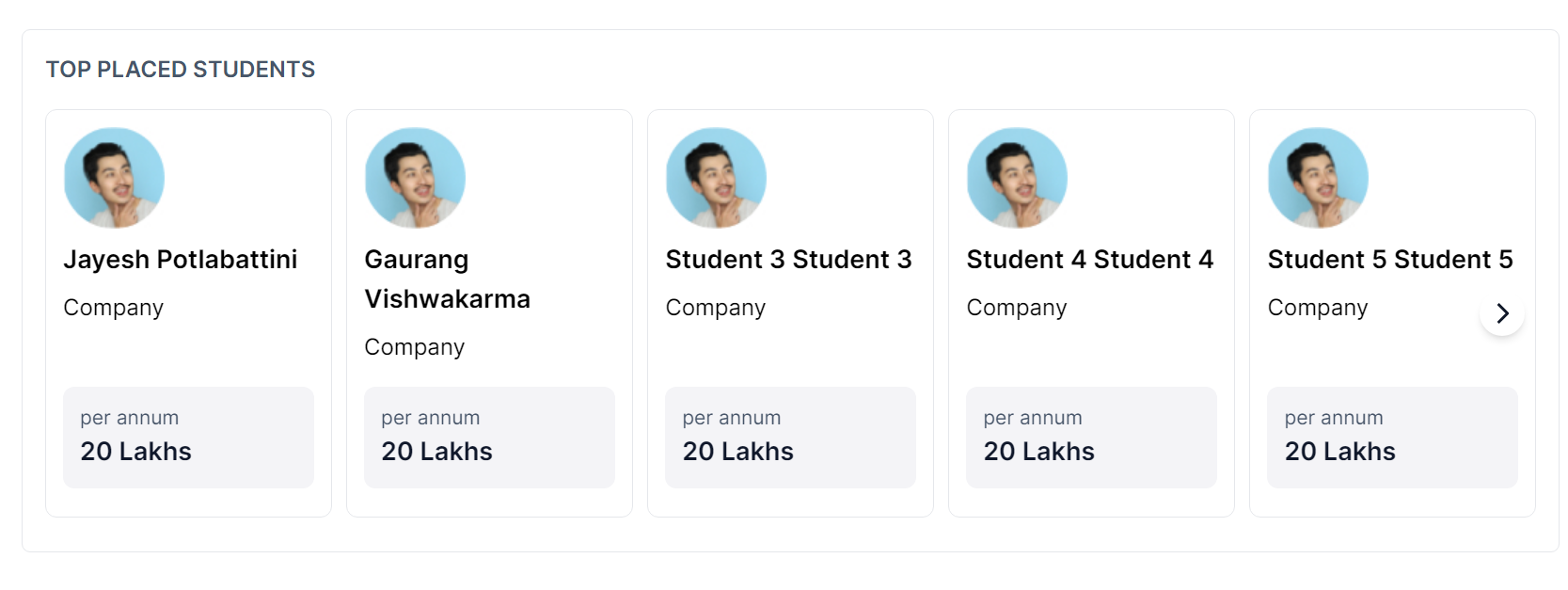
The above steps gives the following output:
Let's move on to the next section, where we will see how we implemented Placed Students section.