Industry Interaction
To bridge the gap between academics and expectations from industries, TNP cell of TCET facilitates students to engage with various industries, gain practical exposure and develop industry relevant skills. The Industry Interaction page of TNP website provides you insights on various programmes and interactions taking place between industries and students in TCET. This page is accesible through the navigation bar of TNP website.
Creating a layout
To set up a basic layout of the page and to create a section that would briefly describe the content of the page, following steps are executed:
Creating a "industry-interaction.astro" file.
We need to define an array which will store all the information that will be used throughout the page. The
IndustryInteractionDataarray is defined with the following properties:industry-interaction.astroconst IndustryInteractionData: IndustryInteractionType[] = [
{
companyLogo: //company logo comes here,
companyName: //company name,
themeColor: //define the theme of the card,
description: //brief description of the event,
subdescription: //subdescription of the event,
eventImages: [ //array of images along with alt text
{
img: ,
alt: ,
},
{...}
],
},
]The next step is to set the main layout of the page. Within the
<Layout>component, the title and description of the page is defined. The classes are defined under<main>component defining the spacing and padding.industry-interaction.astro<Layout
title= // Title of the page
description= //Description of the page
>
<main class="block !space-y-6 md:!space-y-12 lg:!space-y-24 w-full px-8 md:px-16"
>
// Define the layout of the page
</main>
</Layout>The Industry Interaction section of the page is wrapped in a
<div>component with a class defining a flex container. Within this container, the first<div>element contains<p>elements with the title "Industry Interaction" and a description text.industry-interaction.astro<div class="w-full flex flex-col-reverse md:flex-row">
<div class="h-full xl:w-1/2 md:w-1/2 sm:w-full p-3">
<p class="text-4xl 2xl:text-6xl font-title mb-4">Industry Interaction</p>
<p class="text-slate-600">
// description text
</p>
</div>
// other elements
</div>The second
<div>element inside the container defines classes to create background circles for creating a visually pleasing page.industry-interaction.astro<div class="absolute bg-gray-400 w-96 h-96 -left-14 top-25 -z-10 rounded-full flex justify-center bg-gradient-to-l from-gray-100 to-white">
<div class="bg-white w-72 h-72 rounded-full mt-12"></div>
</div>The third
<div>element is defined with a flex layout to create a container in which the data inIndustryInteractionDataarray will be iterated over to create cards for each data item.industry-interaction.astro{
IndustryInteractionData.slice(0,2).map((data) => (
<div class={`...`} // a class defining the size and flex layout
style={{...}} > //setting the border color and bg color according to the theme color
<img src={data.companyLogo} class="rounded-full w-12" />
<p class=" mb-1 mt-3 ">{data.companyName}</p>
<p class="text-slate-600 font-light text-sm">
{data.subdescription}
</p>
<a
href={'#'+data.companyName}
class={`...`}
>
Read More ↓
</a>
</div>
))
}
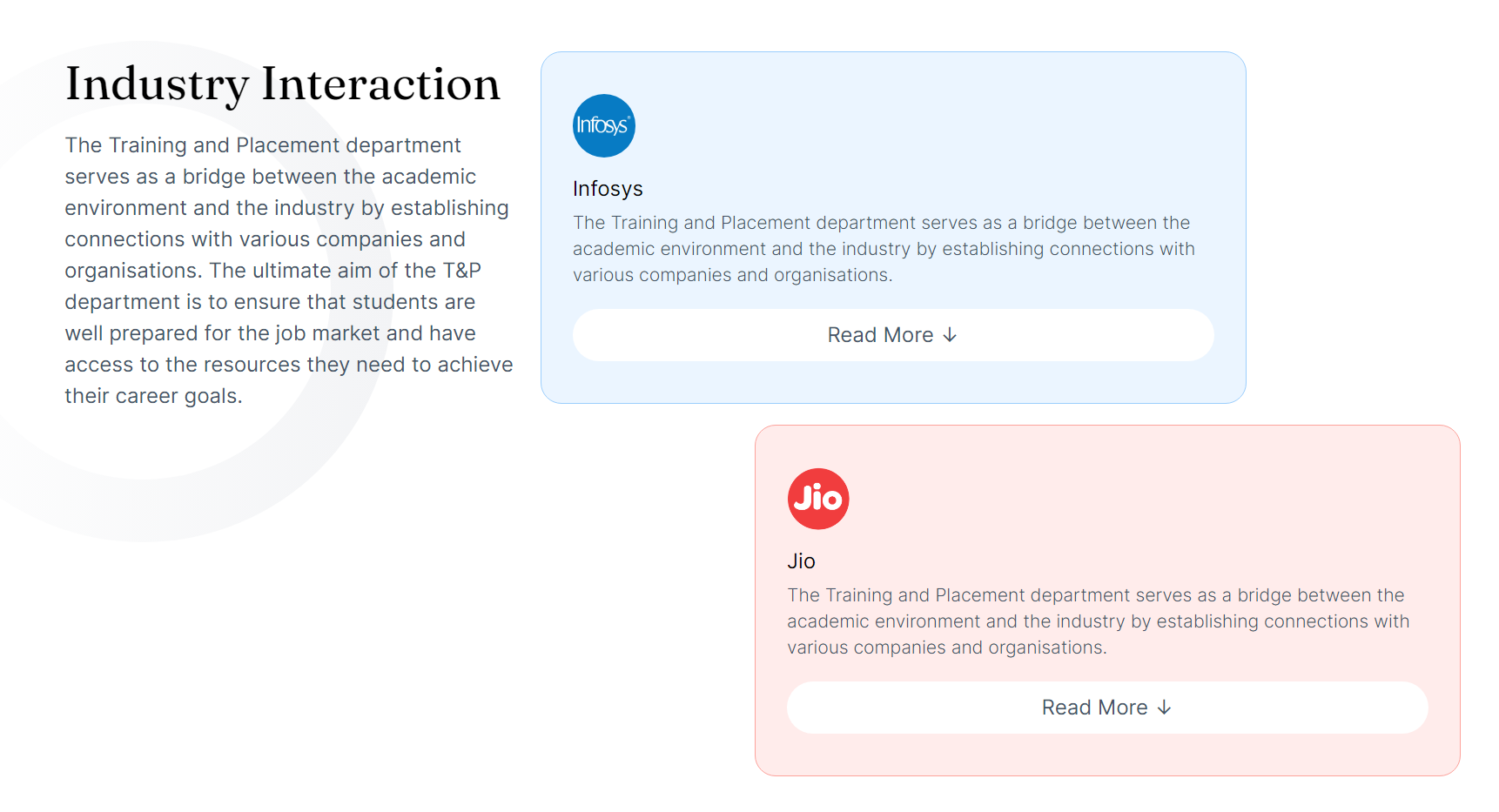
Each card contains company logo, name, subdescription and Read More link.
After the "Industry Interaction" section, a container is defined where event sections for each company will be described based on the array data.
industry-interaction.astro{
IndustryInteractionData.map((data) => (
<div class={`...`}
id={data.companyName}
style={{'...'}} //set the background color according to the theme color of the data
>
<div class={`...`} >
<img
class="rounded-full w-12 mb-4 mt-4"
src={data.companyLogo}
/>
<p class="text-3xl font-title mb-4">
{data.companyName} Industry Interaction
</p>
<p class="text-sm xl:text-base text-slate-600 ">{data.description}</p>
</div>
<div class=" flex justify-center w-full lg:w-1/2">
<IndustryInteractionSwiper client:load data={data.eventImages} />
</div>
</div>
))
}
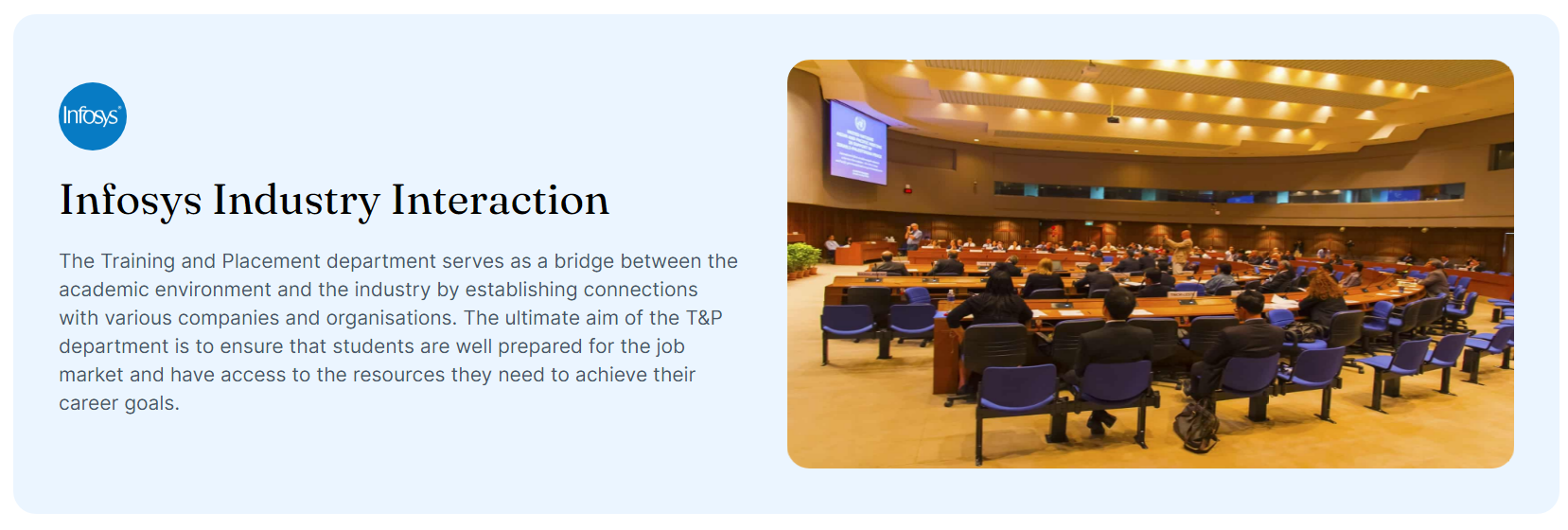
Each event section will contain logo, name, description and IndustryInteractionSwiper component. The IndustryInteractionSwiper component is rendered for each event item using the data.eventImages as data drop.
- Save your progress.
This is what the page's hero section looks like:
In the next part, we are going to see how we created "IndustryInteractionSwiper" component.
Creating IndustryInteractionSwiper
In order to create slides of images, we need to create a react functional component.
Here's how we implemented this component:
Creating a IndustryInteractionSwiper.tsx file.
Importing all the required dependencies,
imageLinkfrom../../envmodule and necessary CSS styles for Swiper.IndustryInteractionSwiper.tsximport { Swiper, SwiperSlide } from "swiper/react";
import { Pagination, A11y, Autoplay } from "swiper";
import type { imageLink } from "../../env";
import "swiper/css";
import "swiper/css/pagination";Creating a react functional component
IndustryInteractionSwiperin the following way:IndustryInteractionSwiper.tsxconst IndustryInteractionSwiper: React.FC<{
data: imageLink[];
}> = ({ data }) => {
return (
// Component JSX goes here
);
};
export default IndustryInteractionSwiper;Creating a
Swipercomponent within the component defined above to define the behaviour and appearance of the component. This can be done in the following way:IndustryInteractionSwiper.tsx<Swiper
modules={[A11y, Autoplay]}
autoplay={{
delay: 2500,
}}
spaceBetween={50} //Defining the space between slides
slidesPerView={1} //Specifying how many slides should be visible at a time
>
{/* Slides go here */}
</Swiper>In this step,
"modules"prop is used to enable additional features like accesibility and autoplay. The autoplay prop is defined to advance every other slide in 2.5 seconds.The
dataarray is mapped inside the Swiper component andSwiperSlidecomponent is structured for each data array item.IndustryInteractionSwiper.tsx{data.map((d) => (
<SwiperSlide key={d.alt}>
{/* Slide content goes here */}
</SwiperSlide>
))}SwiperSlidecomponent is created to define the content for each slide. An<img>element is defined as follows:IndustryInteractionSwiper.tsx{data.map((d) => (
<SwiperSlide key={d.alt}>
<span className="w-full h-[130%] block" >
<img src={d.img} alt={d.alt} width={600} height={400}className="w-full aspect-video rounded-2xl" />
</span>
</SwiperSlide>
))}The
srcprop is set to theimgandaltproperty of the current data item.Custom CSS is defined to style the component slides.
Save the changes.
Run
yarn devto see the changes in your local environment.
Here's the event section with the Swiper component:
Congratulations, we have successfully implemented the Industry Interaction page. Let's continue to find out how we implemented the Event Page of the TNP website.