About Us
The About Us page of the website provides information about the training and placement organization. It is often one of the most visited pages as it helps visitors understand the purpose, history, and values of the entity. It is accesible through the navigation bar of the TNP Website.
Adding Contact Form
Here are the steps on how we integrated Contact Form in About Us Component
Opening
ContactForm.tsxfile in our projects root directory.Declared a functional component called
ContactFormhaving it's<form>element with the various attributes of the form. The email address that the form data will be sent to when submitted is specified here.ContactForm.tsxconst ContactForm = () => {
return (
<form className="flex flex-col gap-4"
action="mailto:tcet.tnp@thakureducation.org" method="GET"
>
)
}Inside the
<form>element, there are several form fields. The<label>elements provide a description for each form field, and the<input>and<textarea>elements are the actual input fields where the user can enter their data. There are used to fillfirstname,lastname,subjectandmessegeinto the form. Each field has specific attributes liketype,placeholder,name,cols, androwsto define its behavior and appearance. There's a<button>element at the end of the form with styling classes.ContactForm.tsxconst ContactForm = () => {
return (
<form className="flex flex-col gap-4"
action="mailto:tcet.tnp@thakureducation.org" method="GET"
<label className="text-sm pb-1 text-slate-600">First Name</label>
<input
placeholder="Eg: John Doe"
type="text"
className="h-11 bg-gray-50 border border-gray-200 rounded-lg p-3"
/>
// Similar for Last Name and Subject
<span className="flex flex-col">
<label className="text-sm pb-1 text-slate-600 ">Message</label>
<textarea
name="body"
id="text-area"
cols={15}
rows={5}
className="bg-gray-50 border border-gray-200 rounded-lg p-3"
placeholder="Enter your message"
/>
<button
className="flex w-max justify-center items-center bg-blue-500 rounded-lg py-2 px-12 text-white text-base hover:bg-blue-400 mt-2"
placeholder="message"
type="submit"
>
Submit
</button>
</form>
);
};Save the changes.
Run
yarn devon the terminal to see the changes made in your local environment.
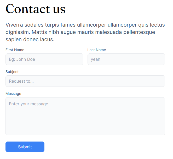
On executing the above steps, the form look like this:
Adding Staff Cards
How to add Staff and their Information to the page
Opening
Staff.tsxfile in our projects root directory.An array of staff data in the format is defined by the
StaffTNPtype. TheStaffTNPtype defines the structure of each staff member's information, such asstaffPhoto,StaffName,designation, andexperties. This information can be changes using these attributes.Staff.tsxconst Staff: React.FC<{
data: StaffTNP[];
}> = ({ data }) => {
return <div className="md:flex grid grid-cols-1 md:justify-between pt-4 flex-wrap gap-8">{data.map(staff => <StaffPost {...staff}/>)}</div>;
};
export default Staff;
const StaffPost = (staffInfo: StaffTNP) => {
return (
<div className="border bg-[#f9fafb] rounded-lg p-4 flex flex-col justify-center items-center gap-2">
<img src={"/Testimonials/"+staffInfo.staffPhoto} alt="staffFoto" className="w-52 rounded-xl"/>
<div className="font-semibold">{staffInfo.StaffName}</div>
<div>{staffInfo.designation}</div>
<div className="bg-[#E4E7EC] px-3 py-2 rounded-lg text-sm w-full text-slate-600 text-center">{staffInfo.experties}</div>
</div>
)
}
Add the staff images in the appropriate directory (/Testimonials/) relative to the staff.
Save the changes to the file.
Run
yarn devon the terminal to see the changes made in your local environment.
Similar steps were carried out for adding multiple cards Staff Cards.
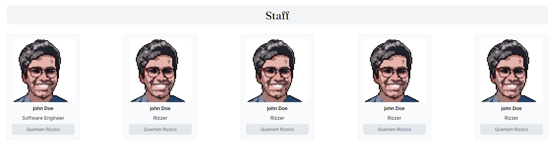
On executing the above steps, the staff section looks like this:
After successfully implementing the About Us component of the TNP (Training and Placement) website, the next step we did was to move forward with the implementation of Footer component.