Navbar
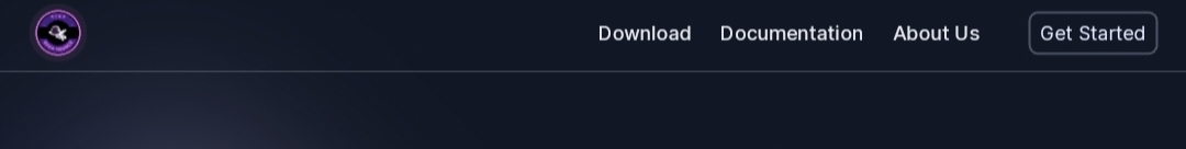
The Navbar is an informative element of the TCET Linux Website. It is located at the top of page and contain TCET OpenSource logo and links to important sections such as Download, About us, Get started and Documention. A well-designed navbar is a critical component of any website, facilitating smooth and intuitive navigation for users, therefore we have created a Navbar that enhances the user experience, adapts to different devices and ensures accessibility.
Here's how we implemented the navbar:
Opening the "Navbar.jsx"file.
This is a React component called
Navbarimplemented by us that represents a navigation bar elements with responsive behavior. Inside the component, we have defined an Array callednavlinksthat contains objects representing different navigation links.Navbar.jsxconst navlinks = [
{
title: "Download",
link: "/#download",
},
{
title: "Documentation",
link: "https://opensource.tcetmumbai.in/docs/projects/tcet-linux/about-tcet-linux",
newtab: true
},
{
title: "About Us",
link: "https://opensource.tcetmumbai.in/docs/about-tcetopensource",
newtab: true
},
]
// futher codeEach object has a title and a link property.
LINE 9 and 14 contains a newtab property, indicating whether the link should be opened in a new tab.
In the same way, we can add another title and link property to get more icon on the Navbar.
Openis a state variable defined by us and its corresponding setter functionsetOpenused to indicate whether the menu is opened or closed.HandleMenu function, which is triggered when the menu button is clicked and logs the current value of open to the console.Navbar.jsx// Array defination
const [open, setOpen] = useState(false);
const handleMenu = () => {
setOpen((prev) => !prev);
console.log(open);};The outermost element is a
<div>representing the background color and font family. Inside the main<div>, there are another<div>elements for responsive styling. This<div>contains the actual navigation bar elements. The navigation bar consists of three sections: logo, navlinks, and hamburger menu.Navbar.jsx// state variable
<div className='bg-[#101828] font-sans'>
<div className="mx-auto px-4 sm:px-6 lg:px-8">
<div className="flex items-center justify-between h-16">
// Logo code
The array and state variable is created to run datamap function ahead, so the code length can be shortened which is easy to understand and use. Refer the Navbar.jsx file.
Logo Section
This section contains the logo of TCET OpenSource Organisation in the navbar.
We have created a
<div>element.we Imported the logo by using href tag from the root folder where image is stored.
Navbar.jsx// state variable
<div className='bg-[#101828] font-sans'>
<div className="mx-auto px-4 sm:px-6 lg:px-8">
<div className="flex items-center justify-between h-16">
<div className="flex items-center">
<a href='/' className='text-white'>
<img src="tcet-opensource-logo.svg" alt="TCET Open Source Logo" srcSet="" />
</a>
</div>
// Other section code
The logo can be updated by changing href pathlink or the image in that path.
Navlinks Section
This section consists of Navlinks of the Navbar of TCET Linux website.
We have used Data map function which is a Advanced Data Structure linked to the Navlinks array created above.
The Mapping function iterates over the navlinks array and creates an a
tagfor each link.The link's href attribute is set to the corresponding link property of the navlinks object.
If the newtab property is true, which opens the link in a new tab.
Each link has additional styling classes for hover effects and rounded corners.
Line 2-15 shows the above data map code .
We created a Get Started icon using
<button>which hovers the user to Installation Guide- Line 16-21 shows the above getting started button.
Navbar.jsx//Logo code
<div className="hidden md:flex">
<div className="text-base 2xl:text-lg ml-10 flex items-baseline space-x-2">
{navlinks.map((link, index) => (
<a
key={index}
className="text-[#E4E7EC] transition-all duration-500 hover:bg-[#475467] hover:text-[#E0EAFF] px-2 py-1 rounded-md text-md font-medium"
href={link.link}
target=
{
link.newtab?"_blank":""
}
>
{link.title}
</a>
))}
<div className="!ml-8 border-2 border-[#475467] rounded-lg">
<button className="inline-flex items-center text-[#E0EAFF] border-1 border-white py-1 px-2 focus:outline-none rounded md:mt-0 hover:bg-[#475467] hover:text-[#E0EAFF] text-base 2xl:text-lg"><a href='/#installation'>Get Started</a>
</button>
</div>
</div>
</div>
Hamburger Section
The
Hamburger menusection is hidden on larger screens.It contains a
<button>with an event handler(onClick)set to the HandleMenu function.The
<button>toggles the value ofopenand displays either the menu icon or the close icon based on the value ofopen.Navbar.jsx<div className="-mr-2 flex md:hidden">
<button
type="button"
onClick={handleMenu}
className='inline-flex items-center justify-center p-2 rounded-lg text-white hover:ring-white focus:outline-none focus:ring-2 focus:rig-offset-2 focus:ring-offset-white focus:ring-white'
>
<span className="sr-only">Open main menu</span>
{open === true ? <FaTimes /> : <FaBars />}
</button>
</div>
</div>
</div>
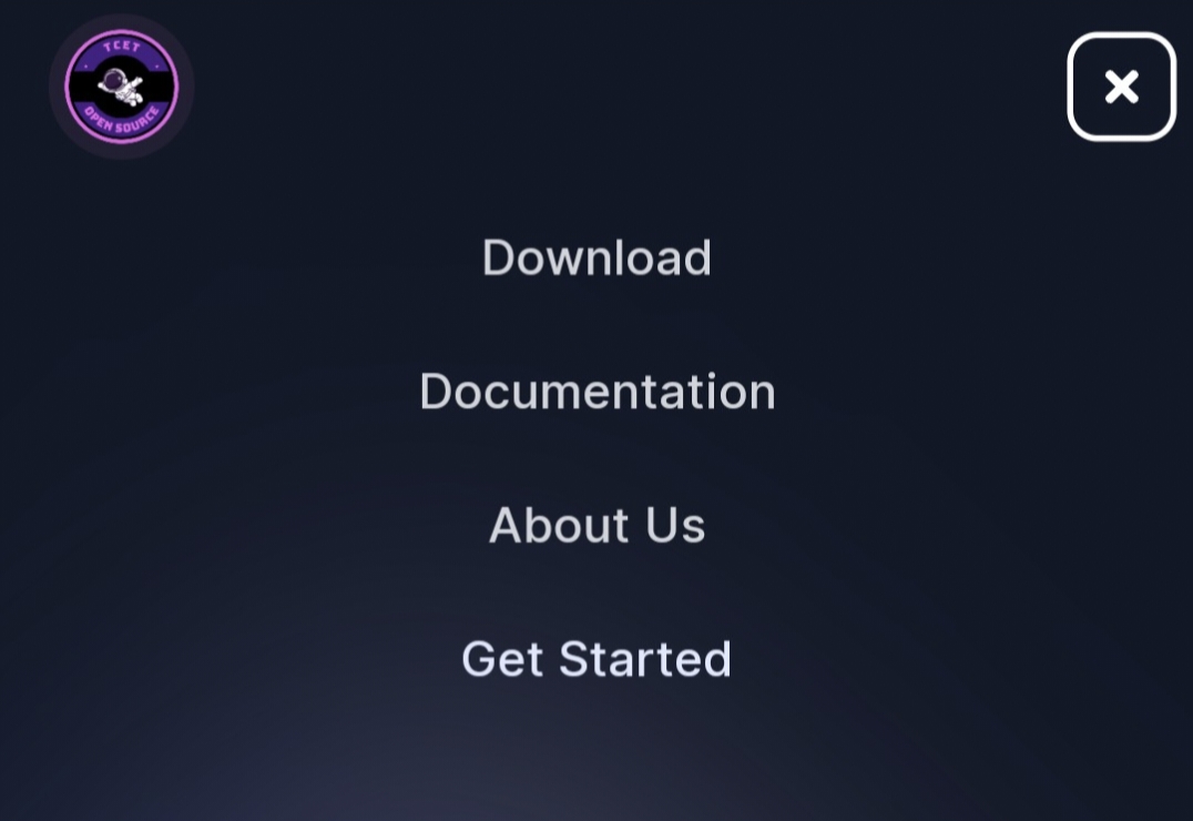
Mobile View Section
This code is written by our team to make the Navbar adjustable according to the
Mobile viewof the user.Following the
navigation bar, there is a conditional rendering statement.- If open is true, a mobile version of the navigation menu is displayed.
We created a
<div>with specific styling for mobile screens.- Inside this
<div>, there is a Mapping function similar to the one in the `navlinks section``, but the styling is adjusted for mobile.
Navbar.jsx{open ? (
<div className='flex flex-col md:hidden'>
<div className="px-2 pt-1 pb-3 space-y-1 sm:px-3">
{navlinks.map((link, index) => (
<a
key={index}
className="text-center cursor-pointer text-gray-300 hover:bg-gray-700 hover:text-white block px-3 py-2 rounded-md text-base font-medium"
href={link.link}
>
{link.title}
</a>
))}
<a href='/Get Started' className="text-center cursor-pointer text-[#E0EAFF] hover:bg-gray-700 hover:text-white block px-3 py-2 rounded-md text-base font-medium">Get Started
</a>
</div>
</div>
) : null}- Inside this
To see how we added Logo, Navlinks and Hamburger on the Navbar, refer Navbar.jsx file from the TCET Linux Website repository.
After adding all components, the Navbar Desktop View can be scene like this :
With this, the Navbar Section was succesfully executed! Let's move on and see how we created the Footer Section of the TCET Linux Website.