Copy To Clipboard
The Copy To Clipboard component is used in the fourth section of the TCET Linux website. The CopyToClipboard component provides a simple and convenient way to copy text to the clipboard. This is a common requirement in many applications, especially those that involve sharing or saving content. It provides visual feedback through the notification dialog, handles user interactions, and enhances the user experience by automatically hiding the dialog and closing it when clicked outside. By encapsulating the copy-to-clipboard functionality within a dedicated component, our codebase becomes more organized and modular. This improves code maintainability, readability, and makes it easier for other developers to understand and modify the code in the future.
Import
Here's a breakdown of the code to understand it's functionality:
- The code imports the necessary dependencies:
React: The core library for building user interfaces in React.
useRef: A hook that creates a mutable ref object to persist a value across component re-renders.useEffect: A hook that allows performing side effects in functional components.useOnClickOutside: A custom hook that handles clicks outside a specified element.CopyToClipboard.tsximport React, { useRef, useEffect } from "react";
import useOnClickOutside from "../hooks/useOnClickOutside";
// CopyToClipboard component
CopyToClipboard
The CopyToClipboard component is defined as a
functioncomponent with a prop type of{ text: string }. It takes a single prop called text, which represents the text to be copied to the clipboard.CopyToClipboard.tsx//Import
const CopyToClipboard: React.FC<{
text: string;
}> = ({ text }) => {
// copyToClipboard component
}
copyToClipboard
Inside the CopyToClipboard component, there is a function copyToClipboard defined. This function is called when the button is clicked and is responsible for copying the text prop value to the clipboard.
Inside the copyToClipboard function:
navigator.clipboard.writeText(text)This line uses the navigator.clipboard API to write the text value to the clipboard.dialog.current?.show(): This line shows the dialog element if it exists (using optional chaining).dialog.current.style.display = "flex": This line sets the CSS display property of the dialog element to "flex".A
setTimeout functionis used to hide the dialog element after 2000 milliseconds (2 seconds). It sets the display property to "none" and closes the dialog.CopyToClipboard.tsx// CopyToClipboard Function
const copyToClipboard = () => {
navigator.clipboard.writeText(text);
dialog.current?.show();
dialog.current.style.display = "flex";
const timer = setTimeout(() => {
dialog.current.style.display = "none";
dialog.current?.close();
}, 2000);
};
// dialog component
dialog
The dialog ref is created using useRef<HTMLDialogElement>(null). It is used to reference the dialog element in the DOM.
Inside the dialog component:
The
useOnClickOutsidecustom hook is called, passing the dialog ref and a callback function. This hook adds an event listener to detect clicks outside the dialog element and calls the callback function when such a click occurs.CopyToClipboard.tsx// copyToClipboard component
const dialog = useRef<HTMLDialogElement>(null);
useOnClickOutside(dialog, () => {
console.log("clickng outside");
dialog.current.style.display = "none";
dialog.current?.close();
});
// return component
return
The major component CopyToClipboard returns a button element representing the copy-to-clipboard button.
- The button has a
classNameprop that applies CSS classes for styling the button's appearance. - The
onClick propis set to the copyToClipboard function, so it is triggered when the button is clicked. - Inside the button element, there is an svg element representing an icon. It uses the SVG format and has attributes for styling and defining the icon path.
- Following the svg element, there is a
dialog elementrepresenting the notification dialog that appears when the text is copied. It initially has a className prop that applies CSS classes for positioning and styling the dialog.
Inside the dialog element, there is a p element containing the text "Copied to clipboard".
CopyToClipboard.tsx// dialog component
return (
<button
className="p-1 border border-slate-400
cursor-pointer
hover:bg-slate-200 hover:bg-opacity-20
active:bg-opacity-40 rounded-lg text-slate-100
overflow-visible "
onClick={copyToClipboard} >
<svg
xmlns="http://www.w3.org/2000/svg"
fill="none"
viewBox="0 0 24 24"
strokeWidth={1.5}
stroke="currentColor"
className="w-6 h-6" >
<path
strokeLinecap="round"
strokeLinejoin="round"
d="M15.666 3.888A2.25 2.25 0 0013.5 2.25h-3c-1. 03 0-1.9.693-2.166 1.638m7.332 0c.055.194.084. 4.084.612v0a.75.75 0 01-.75.75H9a.75.75 0 01-. 75-.75v0c0-.212.03-.418.084-.612m7.332 0c.646. 049 1.288.11 1.927.184 1.1.128 1.907 1.077 1. 907 2.185V19.5a2.25 2.25 0 01-2.25 2.25H6.75A2. 25 2.25 0 014.5 19.5V6.257c0-1.108.806-2.057 1. 907-2.185a48.208 48.208 0 011.927-.184"/>
</svg>
<dialog
ref={dialog}
className="top-3 sm:left-56 w-max items-center rounded-lg h-4 bg-white bg-opacity-60 "
>
<p className="">Copied to clipboard</p>
</dialog>
</button>
);
};
// export CopyToClipboard component
Export
The CopyToClipboard component is exported as the default export component.
        // CopyToClipboard component
    export default CopyToClipboard;
Application
This component can be used by providing the text prop with the desired text to be copied. When the button is clicked, the text will be copied to the clipboard, and a notification dialog will appear briefly to indicate the successful copy operation.
You can visit
- CopyToClipboard.tsx Source Code.
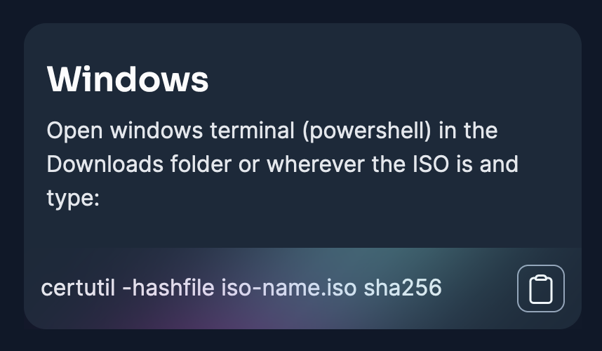
- Verify Downloads Section of the TCET Linux website to see the application of the component.
The Copy To Clipboard component was succesfully executed! Let's move on and see how we created the Download Section component of the TCET Linux Website.