Header
The Header is a section at the top of a webpage that typically contains branding elements, navigation menus, and important information. It helps establish website identity, improves user experience, and ensures easy access to different sections of a website on various devices.
Navigation Links Data
This block of code defines an array called navlinks which stores objects representing navigation links. Each object has a title (the text to display) and a link (the URL to navigate to).
   const navlinks = [
     {
      title: "Home",
      link: "/#Home",
     },
      {
       title: "About Us",
       link: "https://opensource.tcetmumbai.in/docs/about-tcetopensource",
       newtab: true,
      },
     // ...
    ];
- The code defines an array called
navlinksthat contains objects representing the links in the navbar. Each object has a title and a link property.
Some objects also have a newtab property set to true, indicating that the link should open in a new browser tab.
Adding Logo and Name
This section represents the logo and website name Resume Screener on the navbar. It displays the logo image, the name "Resume screener," and applies some styling including a border, gradient background, and a blur effect.
     <div
       className="flex items-center gap-3 rounded-full border-2 border-white border-opacity-25"
       style={{
        background:
         "linear-gradient(218.92deg, rgba(255, 255, 255, 0.25) 30.2%, rgba(255, 255, 255, 0) 105.59%)",
        backdrop: "blur(4px)"
         }}>
          <img src="/Footer/logo.png" alt="" className="h-[48px] p-1" />
         <a href="/" className="text-white">
          <h2 className="text-white font-{400} text-base pr-2.5">
           Resume screener
         </h2>
          </a>
    </div>
- The
divrepresents the logo section of the navbar. It has CSS classes for styling and a style attribute that sets a background gradient and blur effect. Within thisdiv, there is an img tag displaying the logo image and an a tag wrapping the heading text "Resume screener".
On performing the above steps, the logo and name looked like this:
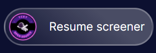
Adding Get Started Button
This section represents the "Get Started" button on the desktop version of the navbar. It is styled with a border, text color, hover effects, and rounded corners. The button contains an a element that links to "/#installation".
   <div className="!ml-8 border-2 border-[#475467] rounded-lg">
      <button className="inline-flex items-center text-[#E0EAFF] border-1 border-white py-1 px-2 focus:outline-none rounded md:mt-0 hover:bg-[#475467] hover:text-[#E0EAFF] text-base 2xl:text-lg">
      <a href="/#installation">Get Started</a>
      </button>
   </div>
- The outer
divhas a left margin, border, and rounded corners. - Inside the
div, there's abuttonelement styled as an inline-flex container with centered items, specific text and border colors, padding, rounded corners, and hover effects. - Within the
button, there's an a element serving as a link with the text "Get Started" and a target URL of /#installation. - On performing the above steps, the Get Started Button looked like this:

Similar steps are carried out to display Logo and Get Started Button on a smaller screen.
Adding three line menu button and Navigation for mobile view
When viewed on phone, the navigation options will be hidden under the three line menu.
Navbar.jsx//to keep the navigation options hidden
<div className="-mr-2 flex md:hidden">
{/* ... */}
</div>
//three line menu button
<button
type="button"
onClick={handleMenu}
className="inline-flex items-center justify-center p-2 rounded-lg text-white hover:ring-white focus:outline-none focus:ring-2 focus:rig-offset-2 focus:ring-offset-white focus:ring-white">
{/* ... */}
</button>The outer
divhas CSS classes to position it as a flex container with negative margin on the right side. It is hidden on medium-sized screens and larger.The
buttonis styled as an inline-flex container with centered items, padding, rounded corners, white text color, and various focus and hover effects.The
onClickevent handler is assigned to the button to trigger thehandleMenufunction when clicked.The navigation links on mobile view would be hidden under the three line menu. The code for mobile nav:
Navbar.jsx{open ? (
<div className="flex flex-col md:hidden">
<div className="px-2 pt-1 pb-3 space-y-1 sm:px-3">
{navlinks.map((link, index) => (
<a
key={index}
className="text-center cursor-pointer text-gray-300 hover:bg-gray-700 hover:text-white block px-3 py-2 rounded-md text-base font-medium"
href={link.link}>
{link.title}
</a>
))}
<a
href="/Get Started"
className="text-center cursor-pointer text-[#E0EAFF] hover:bg-gray-700 hover:text-white block px-3 py-2 rounded-md text-base font-medium">
Get Started
</a>
</div>
</div>
) : null}There is a
divelement with CSS classes that make it a flex container with a column layout. It is hidden on medium-sized screens and smaller.Inside this
div, there is anotherdivelement with CSS classes for padding and spacing.Within this inner
div, there is a mapping over thenavlinksarray using the map function.For each item in the
navlinksarray, an a element is rendered with CSS classes for styling, including text color, hover effects, padding, rounded corners, and font size. The href attribute is set to the link property of the currentnavlinksitem, and the text content of the a element is set to the title property of the currentnavlinksitem.Lastly, there is an additional a element rendered at the end, separate from the
navlinksarray mapping. It has similar CSS classes but a different href attribute value.On execution of the adove codes, the menu and navigation links on the mobile looks like this:

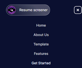
Basically, We have made use of a Hamburger Menu which on being clicked will display the Navigation links.
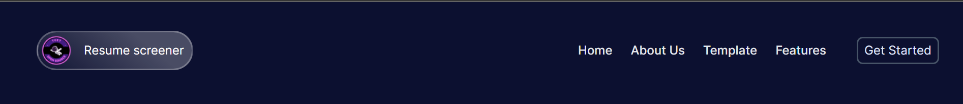
After adding logo, navigation links and 'Get Started' Button The Header looked like this:
The Header Section is succesfully executed! Let's move on and see how we created the Hero Section of the Resume Screener Website.